


How to Make Pie Chart in Google Docs
How to make pie chart in google docs. Learn how to make a pie chart in Google Docs with this step-by-step guide. Build it in Sheets, insert it into your doc


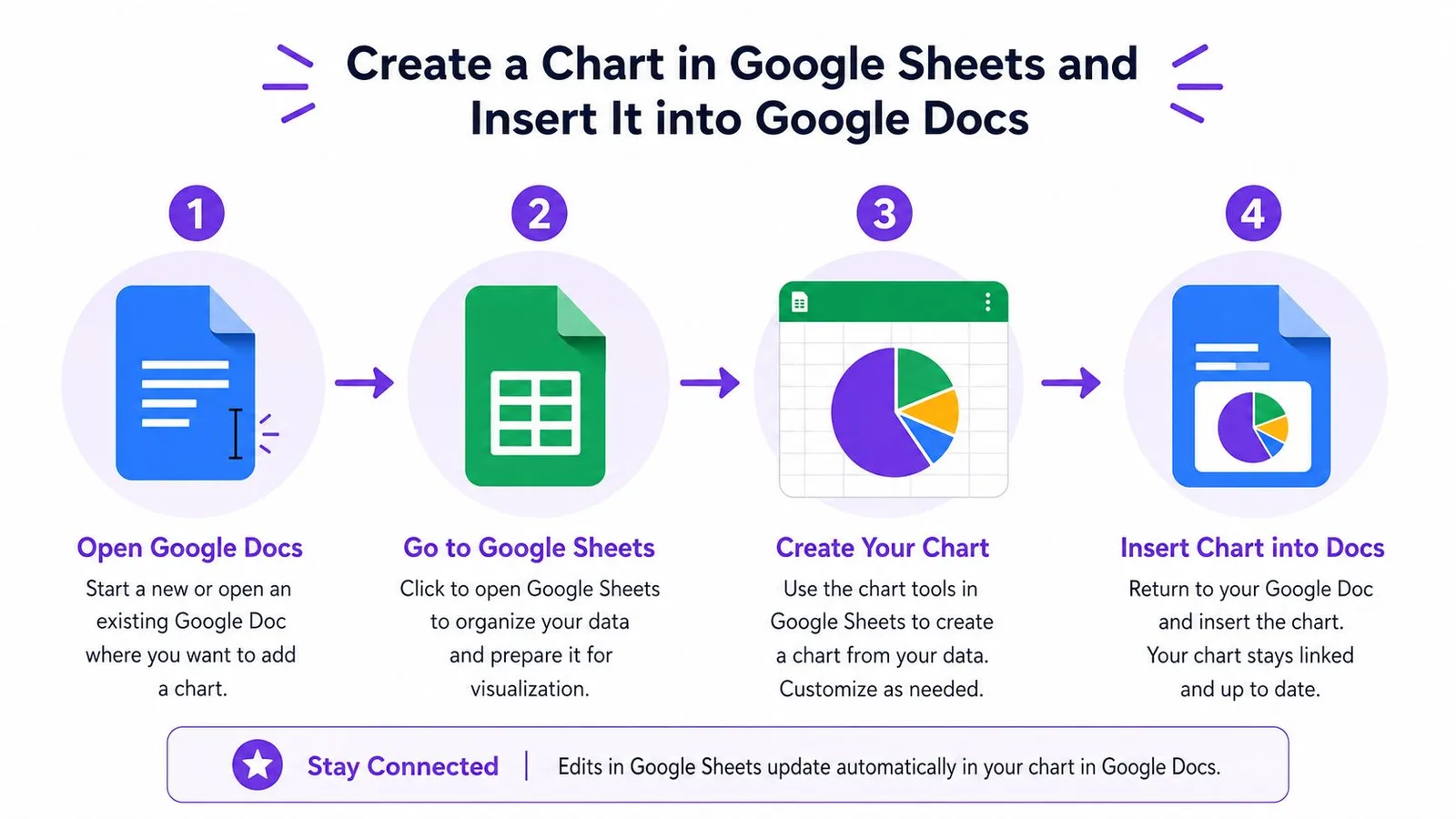
You’re in a Google Doc, the cursor is blinking, and the chart you need doesn’t appear anywhere in the menu. That’s the normal starting point for how to make pie chart in Google Docs, because Docs itself doesn’t really draw the chart from scratch, it pulls the chart in from Google Sheets or accepts a static image. The practical choice is simple, linked Sheets chart first, image only if you need a frozen snapshot.
If you want a quick workflow reference while you work, GPT Workspace sits inside Google Docs and Sheets, so it fits naturally into this same environment.
Table of Contents
- The Quickest Way to Get a Pie Chart Into Your Doc
- Set Up Your Data the Right Way in Google Sheets
- Insert the Pie Chart From Sheets Into Google Docs
- Format the Chart So the Slices Actually Make Sense
- Linked Chart vs Pasted Image Which One to Use
- Keep the Chart Fresh When the Numbers Change
- Quick Checklist and When to Skip the Pie Chart
The Quickest Way to Get a Pie Chart Into Your Doc
The fastest path is to treat the pie chart as a Sheets object that gets inserted into Docs, not as a native Docs drawing. The workflow starts with tabular data in Sheets, turns that data into a chart, then brings the chart into the document as an object you can keep linked or freeze as a snapshot.
If you need something presentable fast, use the route I rely on most: build in Sheets, insert into Docs, keep it linked. Building the chart somewhere else, like Slides, usually means extra cleanup for no real gain. Pasting a static image still has a place, but only after the chart is final and you are sure the numbers will not change.
Practical rule: if the numbers can change after you publish, do not flatten the chart into an image unless you are fine with it staying frozen.
The trade-off shows up after the chart is on the page. A linked chart can stay current, but it also means you need to watch for stale data and formatting drift. A pasted image avoids that, but it can start looking like a clipped screenshot instead of a report-ready visual if the layout around it is not handled well.
If you want a smooth workflow while you work across Docs and Sheets, GPT Workspace fits naturally into that same environment.
Set Up Your Data the Right Way in Google Sheets
A pie chart only reads cleanly when the source table is clean. In Sheets, put category labels in column A and numeric values in column B, with a header row like Category and Amount. Google’s chart workflow uses the first column for labels and the second column for values, so extra columns usually get ignored in the chart range, which is why the layout should stay narrow and deliberate (Google Docs chart help).
Here’s a simple table you can copy into Sheets for a marketing spend example.
Sample Pie Chart Data Layout
| Category | Amount |
|---|---|
| Search | 40 |
| Social | 25 |
| 15 | |
| Referral | 10 |
| Direct | 10 |
That kind of table is easy to scan because the values sum to a whole, and the slice sizes are obvious at a glance. Keep the range free of merged cells, blank rows in the middle, and text hiding in the value column. Also avoid typing percentages as text with percent signs attached, because the chart wants numeric values, not labels pretending to be values.
A lot of people get tripped up by formatting problems, not chart problems. If the data range is messy, the pie chart will faithfully show the mess. I’d also avoid using a half-finished sheet with comments or unrelated notes in adjacent cells, because it increases the chance you’ll select the wrong range when you build the chart.
For a separate cleanup example on Sheets layout pitfalls, this Google Sheets cell-merging guide is the kind of companion reference people usually need once, then keep coming back to.
Insert the Pie Chart From Sheets Into Google Docs
Once the data is clean, return to the Doc and place the cursor where the chart should appear. Use Insert > Chart > From Sheets, then pick the spreadsheet in the file picker. The preview card usually lets you choose the right sheet tab before you import, so use that step to confirm you are pulling the intended range, not a neighboring tab with similar names.
The key choice is Link to spreadsheet. Keep it on if the chart needs to stay connected to the source numbers and reflect later edits. Turn it off only if you want a fixed copy that will never change with the sheet. The chart lands in the document at a default size, and you can move it like any other object once it is inserted.
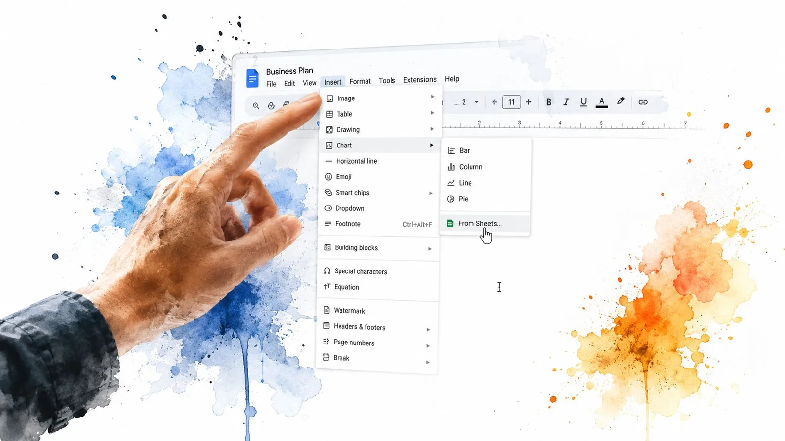
For team docs, a linked insert is usually the safer pick because it keeps the chart tied to the source sheet. A static insert fits final handoff files or archived reports where you do not want later data changes to alter the document. If you paste the chart as an image, it is easier to share across platforms, but you lose the ability to refresh the slices from Sheets.
The mistake I see most often is importing the wrong tab and only noticing after the chart is already in Docs. Check the file, then check the sheet before you click Import. That extra glance saves the back-and-forth of deleting a bad chart and redoing the insert.
Format the Chart So the Slices Actually Make Sense
Click the chart in Docs and the Chart Editor opens in the sidebar. Start in Setup, because that’s where the chart type and data source either match your intent or derail it. Confirm the chart type is Pie chart, make sure Use row 1 as headers and Use column A as labels are set correctly, and verify that the data range points to the exact two-column table you prepared in Sheets.
Then move to Customize, where readability decisions matter more than decoration. The chart title belongs in the title field, and a subtitle can help if the source data needs context. The most important pie-specific control is Slice label, because you need to decide whether readers should see values, percentages, or labels directly on the chart. Google Sheets exposes that choice in the pie-chart customization options, which is the right place to prevent unlabeled wedges from turning into guesswork (Statistics Canada’s chart usability note).
A restrained Color theme works better than default bright primaries when the chart sits inside a report. Slice border color also helps separate adjacent wedges, especially when two categories are close in shade. If you’re showing categories that need quick reading, a labeled slice with a clean palette usually beats a pretty but cryptic chart.
A chart that says Category (XX%) does less work for the reader than one that forces them to decode each wedge manually.
That difference sounds minor, but in a doc shared across a team, it changes how fast someone can move from the visual to the takeaway. The label setting is not cosmetic. It’s the part that turns a chart from decorative into useful.
Linked Chart vs Pasted Image Which One to Use
Once the chart is in the doc, you’re choosing between keeping it linked and flattening it into an image. The linked version stays connected to Sheets, so edits in the source file can flow into the document after you refresh. The image version is static, which sounds limiting, but it also means the chart won’t break if the spreadsheet gets renamed, moved, or removed from access.
| Decision point | Linked to Sheet | Pasted as Image |
|---|---|---|
| Updating data | Can refresh from the spreadsheet | Cannot refresh |
| Editing labels and values | Managed in Sheets | Harder to revise cleanly |
| Portability | Depends on source access | Self-contained in the doc |
| Best use case | Living reports and shared drafts | Final snapshots and archived files |
Linked charts work well in collaborative reporting because the source of truth stays in Sheets. The downside is governance. If a teammate changes the spreadsheet from another account, or you lose permission to the file, the chart can stop behaving the way you expect. The image route avoids that, but it also means every correction becomes a manual replacement.
For teams building docs that still evolve after circulation, the link usually wins. For documents that are meant to stay frozen, the image is simpler. Google Docs also supports inserting images as document objects with sizing controls, which is why the static route is so straightforward when you already know the chart won’t move again (Google Docs images API).
Keep the Chart Fresh When the Numbers Change
A linked chart doesn’t update itself in real time while you’re staring at the doc. If someone edits the Sheet, the Docs view can stay stale until the chart is refreshed. That’s the common failure mode in shared reporting, one person fixes the numbers, another person keeps reading yesterday’s version.
With the chart selected, use the dropdown arrow in the upper-right corner of the chart frame and choose Update. If the source sheet is still in place and the chart link is intact, that refresh pulls the new values into the doc. The chart also tends to update when the document is reopened, as long as the source location hasn’t changed.
Checklist: open the source Sheet, confirm the link still exists, refresh the chart from the dropdown, then re-check the slice labels against the new category names.
If the chart looks wrong after an edit, don’t start by rebuilding it. Reopen the spreadsheet, confirm the values are still in the expected cells, then refresh the chart in Docs. That workflow is the difference between a chart that stays trustworthy and one that drifts out of sync.
For people who live in spreadsheet-driven docs, GPT Workspace for Sheets can sit alongside this workflow when the heavier work is data cleanup, labeling, or drafting around the chart rather than replacing the chart itself.
Quick Checklist and When to Skip the Pie Chart
The whole workflow is straightforward when you keep it disciplined. Build the two-column table in Sheets, select the exact data range, open the chart sidebar, choose Pie chart under Setup, then return to Docs and use Insert > Chart > From Sheets. After that, confirm the link setting, move the chart into place, and adjust the labels so the reader doesn’t have to guess.
A pie chart works best when you’re showing parts of one total, especially when the number of slices stays modest and the values are easy to compare. It struggles when categories multiply, when slices are nearly the same size, when the data includes negatives, or when you’re trying to show a trend over time. In those cases, a bar chart makes comparisons faster, and a stacked bar is often clearer for part-to-whole across groups.
The test is not whether Google Docs can display a pie chart. It’s whether the chart helps someone read the report faster. If the answer is no, the better move is to switch visuals instead of forcing the pie chart to do work it wasn’t built for.
If your team builds reports in Google Docs and Sheets every week, GPT Workspace can help draft the narrative around the chart, clean up the spreadsheet text, and keep the document moving without leaving Google Workspace. It fits the same workflow you’ve just used here, so it’s worth trying on your next report or client update.