






Google Sheets Line of Best Fit: A Practical Guide
Learn how to add, customize, and interpret a Google Sheets line of best fit with trendlines, LINEST, SLOPE, and INTERCEPT functions in this practical guide.


A sales manager has a scatter chart open in Google Sheets, with regional revenue spread across the year. The points don’t form a perfect pattern, and the immediate question is practical: does the next period look more likely to grow, flatten, or decline? Eyeballing the chart can suggest an answer, but it can’t show precisely how much the outcome changes as the input changes.
A Google Sheets line of best fit turns that scattered plot into a directional signal. The chart can make the pattern easy to communicate, while formulas can expose the underlying slope, intercept, and goodness-of-fit values for a forecast or dashboard. The difference matters because a line that’s useful in a presentation isn’t automatically a model you should trust.
Table of Contents
- When a Line of Best Fit Actually Helps
- Adding a Trendline Inside the Chart Editor
- Choosing the Right Trendline Type
- Reading the Equation and R Squared
- Building the Same Fit Using Formulas
- When the Line of Best Fit Misleads You
- A Reusable Workflow for Your Own Data
When a Line of Best Fit Actually Helps
A line of best fit helps when the question is about direction and relationship, not certainty. If revenue generally rises as time passes, a fitted line summarizes that movement more clearly than a cluster of unrelated points. It can help a manager frame a planning conversation, identify a broad change in performance, or decide whether the data deserves deeper analysis.
Google Sheets gives you two practical routes.
The chart route
The first route uses the chart editor. Add a trendline to a scatter or line chart, choose a suitable type, and Sheets draws the fitted line over the observations. The chart editor can also expose the equation and R squared, making this route quick and presentation-ready. Google’s trendline workflow uses Customize, then Series, where you select Trendline and adjust its settings. The documented chart-editor path for adding a trendline in Google Sheets is the fastest option when the audience mainly needs to see the pattern.
The limitation is auditability. The fitted values live inside the chart, so they aren’t as convenient to reuse in formulas, forecast columns, or controlled dashboard calculations.
The formula route
The second route uses SLOPE, INTERCEPT, and LINEST. These functions return the model’s numerical components in cells, where you can reference, review, label, and recalculate them. That makes the formula route better for operational work, especially when the fitted values need to feed another calculation.
Practical rule: Use the chart for communication and the formulas for verification.
Choose the route before building the sheet. If you only need a visual explanation, the chart may be enough. If someone will challenge the result, reuse it in a forecast, or maintain it after the source range changes, build the cell-based version as well.
Adding a Trendline Inside the Chart Editor
A reliable trendline starts with a clean chart range. Put the X-axis values in one column and their matching Y-axis values in another, using numeric values in both. Keep each pair on the same row, and remove blank rows that split the range. Numbers stored as text, missing pairs, or mismatched ranges can produce an incorrect chart or hide the trendline control.
Select both columns, choose Insert, then Chart. In the Chart type menu, choose a scatter chart when X represents a measurable independent variable. A line chart can also display a trendline, but a scatter chart makes the numeric relationship between X and Y clearer.
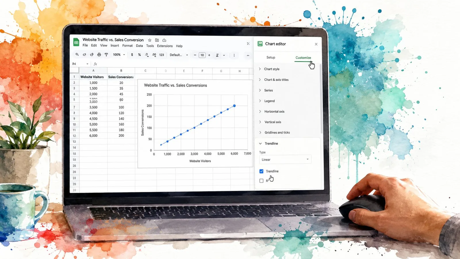
Double-click the chart to open the Chart editor:
- Select Customize.
- Expand Series.
- Scroll to the Trendline setting.
- Change None to Linear.
Sheets should draw the line immediately. A linear trendline fits a straight relationship, where Y changes at a broadly steady rate as X changes. The control appears for scatter and line charts, not bar or pie charts. If it is missing, check the chart type first, then confirm that the selected range contains usable numeric pairs.
The dropdown also includes logarithmic, exponential, polynomial, and moving average options. Do not choose among them only by appearance. A curve can look persuasive while representing the underlying process poorly. Use the chart to inspect the pattern, then verify the fit with LINEST, SLOPE, and INTERCEPT before relying on it in a forecast or dashboard.
This walkthrough shows the interaction in context:
If the option still does not appear, review the chart type and source range against the Google Sheets trendline instructions. Use the visual line for quick communication, but keep the formula-based fit available when the result needs checking or reuse.
Choosing the Right Trendline Type
Linear is useful, but it shouldn’t be your automatic choice. Google Sheets supports linear, exponential, polynomial, logarithmic, power, and moving average trendline types, giving you several ways to represent different data patterns. This overview of Google Sheets trendline types describes the available options and their intended use.
| Trendline Type | Data Pattern | Typical Use Case |
|---|---|---|
| Linear | A roughly constant increase or decrease | Steady operational growth or decline |
| Exponential | Growth or decay that changes by a proportion | Adoption curves or compounding processes |
| Polynomial | A relationship that bends or changes direction | Curved data with one or more turning points |
| Logarithmic | A sharp early movement that gradually flattens | Learning effects or saturation |
| Power | Variables that scale together through a power relationship | Physical or scientific relationships |
| Moving average | Short-term volatility smoothed into a trailing direction | Monitoring a changing series without extrapolating |
A linear fit is appropriate when each change in X corresponds to a broadly consistent change in Y. An exponential fit makes more sense when the value grows or decays proportionally, rather than by a fixed amount. A viral adoption pattern and compound interest are conceptually different from steady monthly additions, even if both rise on a chart.
A logarithmic curve suits data that moves quickly at first and then levels off. A polynomial fit can represent a curve that bends once or twice, but higher-order polynomials often become difficult to justify. In practice, polynomial fits beyond order four are especially risky because they can follow noise rather than the process.
A power relationship is useful when both variables scale together, such as area and radius squared. A moving average smooths volatility, but it doesn’t function like a normal extrapolating forecast. It follows the recent pattern rather than projecting a structural relationship beyond the observed range.
A curve that fits the visible points can still predict badly outside the visible range.
Don’t choose a model only because it produces the highest R squared. A wrong model can fit historical observations convincingly while failing to represent the mechanism that generated them. Start with the data-generating process, then use fit measures as supporting evidence.
Reading the Equation and R Squared
With the trendline enabled, open Customize, expand Series, and inspect its labels. Set Label to Equation, then enable R squared. Google Sheets places both values on the chart, giving you a quick visual check before you rely on the fit. a video walkthrough of trendline labels shows where these settings appear.
For a linear fit, the displayed equation usually follows:
y = mx + b
The slope, m, is the expected change in Y for each one-unit increase in X. The intercept, b, is the fitted Y value when X equals zero. That value may be mathematically useful even when zero is outside the actual operating range, so it should not automatically be read as an observed baseline.
R² describes how much variation in the observed Y values the fitted line explains. It ranges from zero to one. A value near one means the points sit close to the selected model. A lower value means more variation remains outside the line. R² measures fit, not whether the chosen relationship makes sense.
Consider this small dataset:
- X values:
{1, 2, 3, 4, 5} - Y values:
{2.1, 3.9, 6.2, 7.8, 10.1}
The linear fit should produce approximately:
y = 1.99x + 0.06
with R² approximately 0.999. The slope indicates that Y rises roughly 1.99 for every additional unit of X in this fitted relationship. The intercept is close to zero, and the high R² shows that these observations lie very close to the line. It does not confirm that a linear model will remain valid outside the observed values.
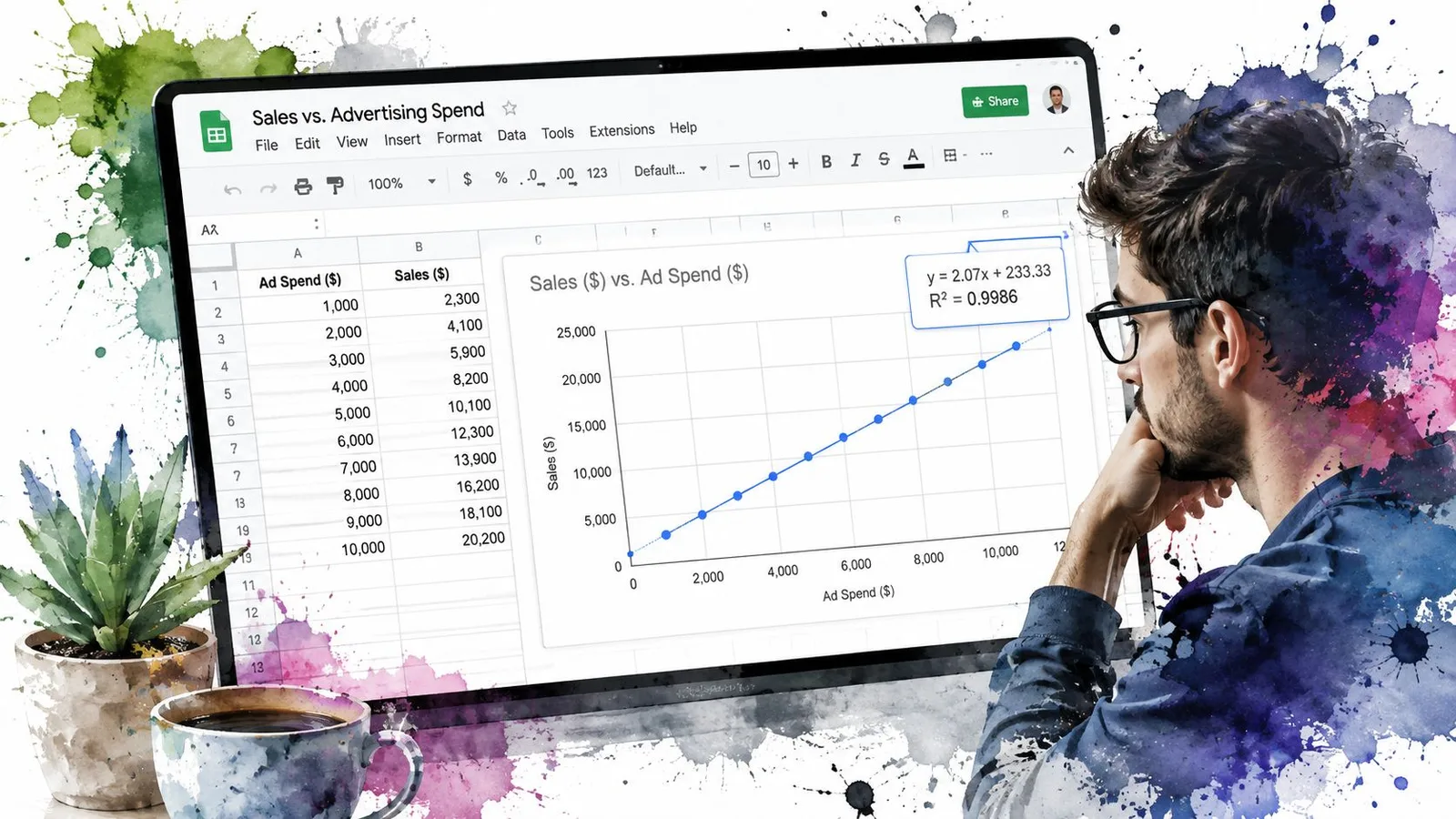
Use the chart as a readable summary, then verify its equation and fit with cell formulas or GPT Data Analyst for spreadsheet analysis. The chart shows the result, while formulas make the calculation auditable. R² is a directional signal, not proof that the model is correct. A high value from an unsuitable model still supports a misleading conclusion.
Building the Same Fit Using Formulas
The chart trendline is convenient, but it keeps the regression details inside the visualization. You can reproduce the linear fit in cells with three core functions:
SLOPE(known_y, known_x)returns the slope,m.INTERCEPT(known_y, known_x)returns the intercept,b.LINEST(known_y, known_x)returns the slope and intercept together.
Using the worked dataset in columns A and B, with X in A2:A6 and Y in B2:B6, enter:
=SLOPE(B2:B6, A2:A6)
This returns approximately 1.99. Then use:
=INTERCEPT(B2:B6, A2:A6)
which returns approximately 0.06. A basic LINEST call returns the same slope and intercept pair:
=LINEST(B2:B6, A2:A6)
LINEST becomes more valuable when you expand its output. With the appropriate four-cell array configuration, it can also expose standard errors, giving reviewers more information than the chart label alone.
| Function | Syntax in Google Sheets | Returned Value |
|---|---|---|
SLOPE | =SLOPE(B2:B6, A2:A6) | Approximately 1.99 |
INTERCEPT | =INTERCEPT(B2:B6, A2:A6) | Approximately 0.06 |
LINEST | =LINEST(B2:B6, A2:A6) | The same slope and intercept pair |
RSQ | =RSQ(B2:B6, A2:A6) | Approximately 0.999 |
You can generate a readable equation in one cell by joining the outputs:
="y = "&ROUND(SLOPE(B2:B6, A2:A6),2)&"x + "&ROUND(INTERCEPT(B2:B6, A2:A6),2)
For R², use:
=RSQ(B2:B6, A2:A6)
This cell-based approach creates an auditable summary. A reviewer can inspect the ranges, recompute the values, and use them in downstream formulas. A formula assistant such as the Google Sheets formula generator can help draft syntax, but you should still validate the ranges and the returned values yourself.
The practical advantage isn’t that formulas replace charts. It’s that they give the chart a checkable foundation.
When the Line of Best Fit Misleads You
A line of best fit is a summary, not a verdict. The most polished chart can mislead when the dataset is too small, contains influential outliers, or follows a shape the selected model can’t represent.
Small samples deserve restraint. With only five points, a line can look tidy even though the slope may change substantially when another observation arrives. Outliers create a different problem. One unusually high or low value can pull the fitted line toward itself and hide the pattern followed by the remaining observations.
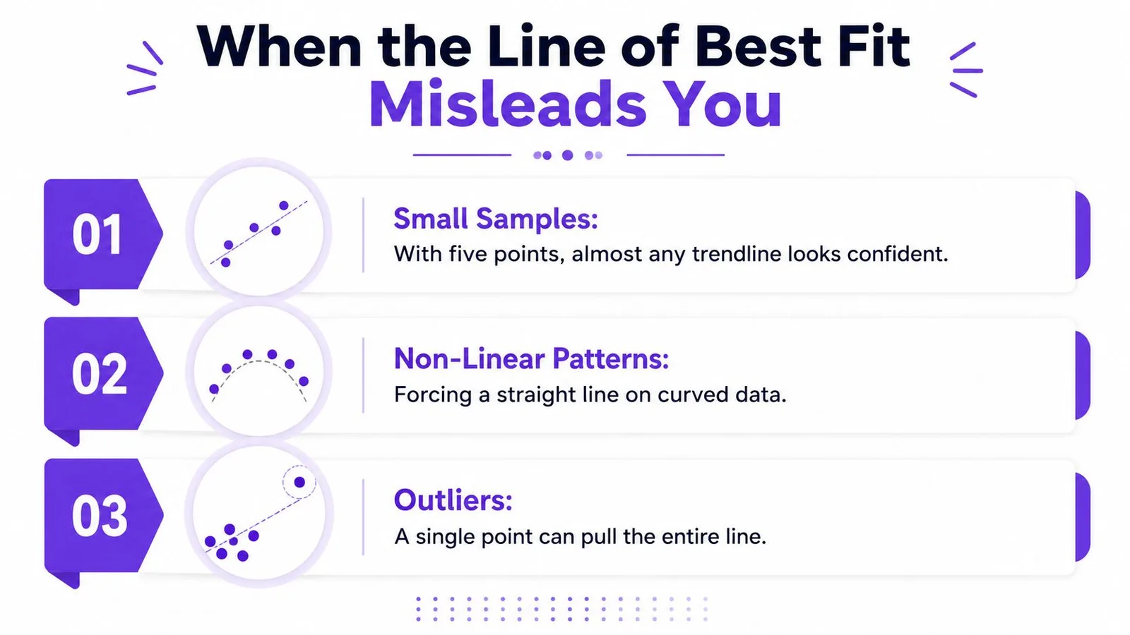
Three checks before trusting the fit
- Small samples: Treat a neat line as provisional when the dataset contains very few observations.
- Nonlinear patterns: Don’t force a straight line onto a curve, seasonal movement, or a process that accelerates.
- Outliers: Plot the raw points first so one distant observation can’t hide its influence.
A low R² can reveal that the selected model misses important structure, but a high R² doesn’t clear every concern. A polynomial with an unsuitable degree can bend through noise, while a linear model can conceal seasonality by averaging across repeated cycles.
Time-series data adds another complication. Adjacent observations can influence one another, which violates the independence assumption behind ordinary least-squares reasoning. That can make confidence in the slope look stronger than the underlying evidence supports. Non-constant variance creates a related warning sign, with residuals spreading out or narrowing as X changes.
Use residuals as a basic diagnostic. Plot the difference between each observed Y and its fitted Y, look for systematic curves or expanding spread, and reserve part of the data as a holdout when the decision matters. Ask whether the relationship makes sense before accepting the number on screen.
A Reusable Workflow for Your Own Data
A dependable workflow combines the chart’s communication strength with the formulas’ audit trail. The chart helps people see the relationship quickly. SLOPE, INTERCEPT, LINEST, and RSQ let you verify what the chart is displaying and preserve the values for later calculations.
A five-step checklist
-
Validate the source range. Confirm that both columns contain numeric values, that each X value has a matching Y value, and that headers or blank rows aren’t being interpreted as observations.
-
Create a scatter plot. Use the two-column range to build a chart. A scatter plot keeps the numeric relationship between X and Y visible instead of treating the horizontal axis as labels only.
-
Add the visual fit. Open the chart editor, select Customize, expand Series, and choose a trendline. Start with Linear only when the process supports a constant-rate relationship.
-
Expose Equation and R². Turn on both labels so the chart shows the model’s structure and fit quality. If the chosen curve isn’t linear, interpret the displayed equation according to that curve’s form rather than forcing it into
y = mx + b. -
Reconcile and test. Compare the chart values with
SLOPE,INTERCEPT, orLINEST, then inspect residuals and influential observations before publishing the result.
Store the slope, intercept, and R² in clearly labeled cells. That keeps downstream forecasts readable when the source range changes, and it gives another person a direct route to audit the calculation. If you use AI in Google Sheets to assist with formulas or analysis, treat the generated output as a draft and verify the ranges, model type, and interpretation.
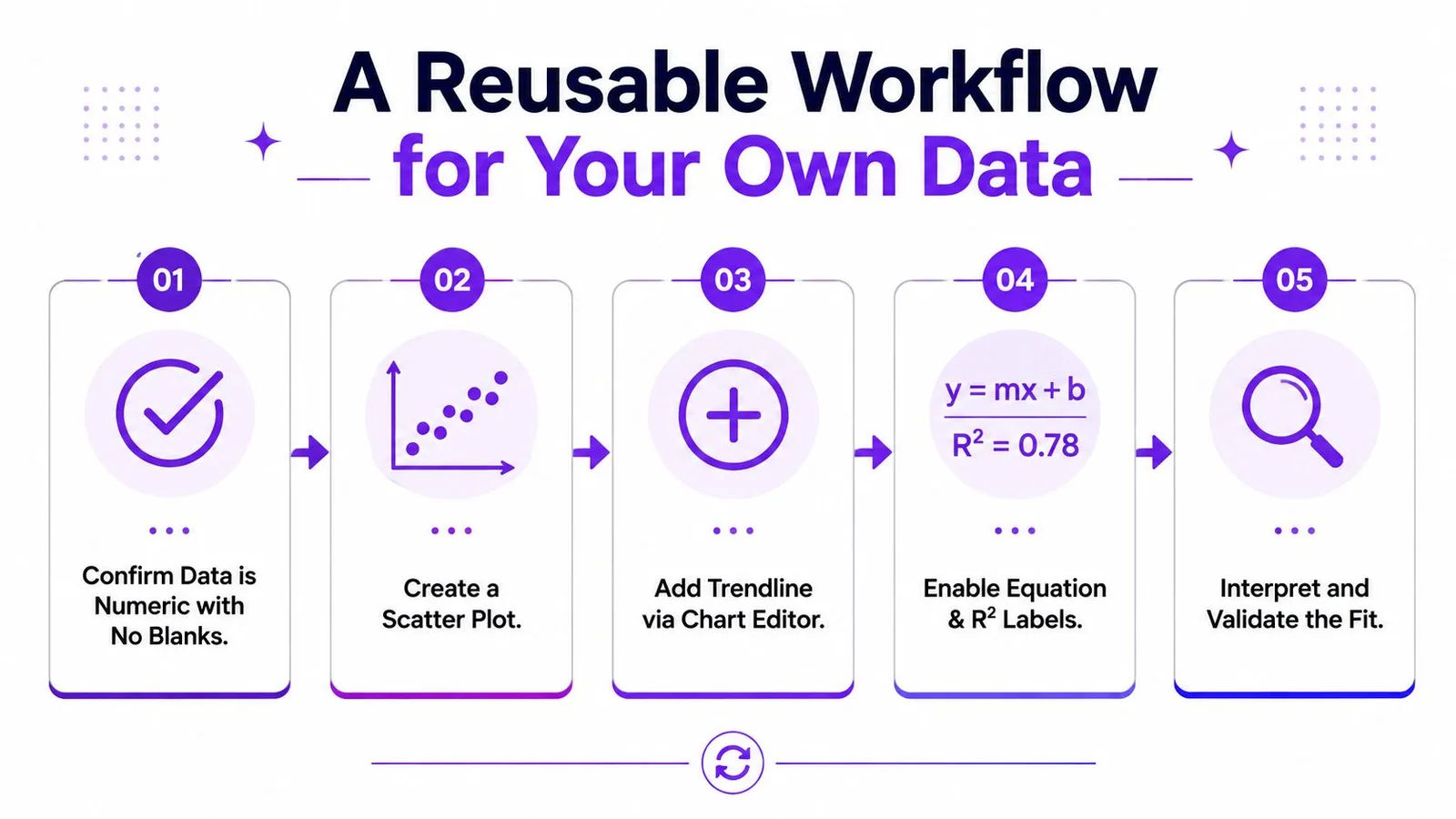
The strongest Google Sheets line of best fit workflow is therefore deliberately two-part: visualize the relationship, then reproduce it in formulas. That combination makes the result easier to explain without leaving the underlying calculation hidden.
GPT Workspace brings AI assistance into Google Sheets for formula generation, selected-range analysis, data cleaning, chart building, and spreadsheet summarization. If you want help checking a trendline workflow while keeping the work inside Google Workspace, visit GPT Workspace.